The goal of this project was to transform unprocessed data into an engaging, informative, and dynamic infographic. The purpose of the graphics is to present complicated information in an understandable and straightforward way. This project, which was created entirely in Illustrator, for Graphic Design.
The biggest challenge of this project was simplifying data, visual hierarchy and technical execution. At the start of the project all that was given was a written document of all the information needed, not in any specific order. It was important to take this information, slightly simplify it and determine what was most important to create the best hierarchy. When designing the infographic there was a lot of moving and resizing content to get everything to fit perfectly but still visually look good.
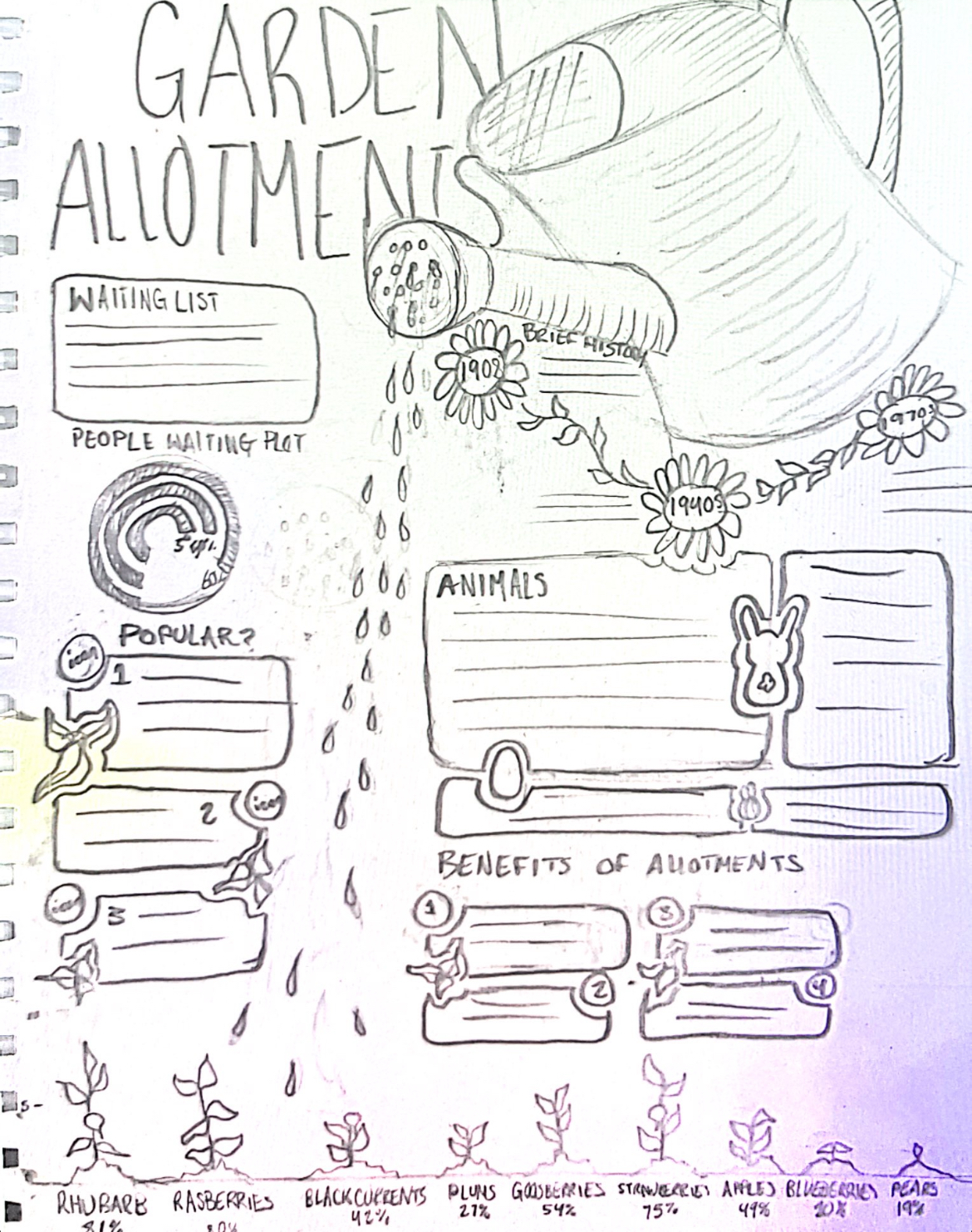
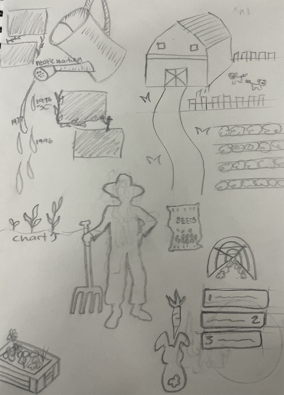
The process for this project had many important steps. The first step was to do research to learn about the subject matter and get the right information. After that, mood boards and sources of inspiration were used to find a visual direction. Then, mind mapping was used to organize ideas and find connections. The sketches were then turned into the first design ideas, which were improved through a number of changes until the final infographic was finished.
My solution to this project was to showcase a watering can growing the plants below and having all the information follow the flow of the main design. Also adding compelling graphics to peek readers interest.

.svg)
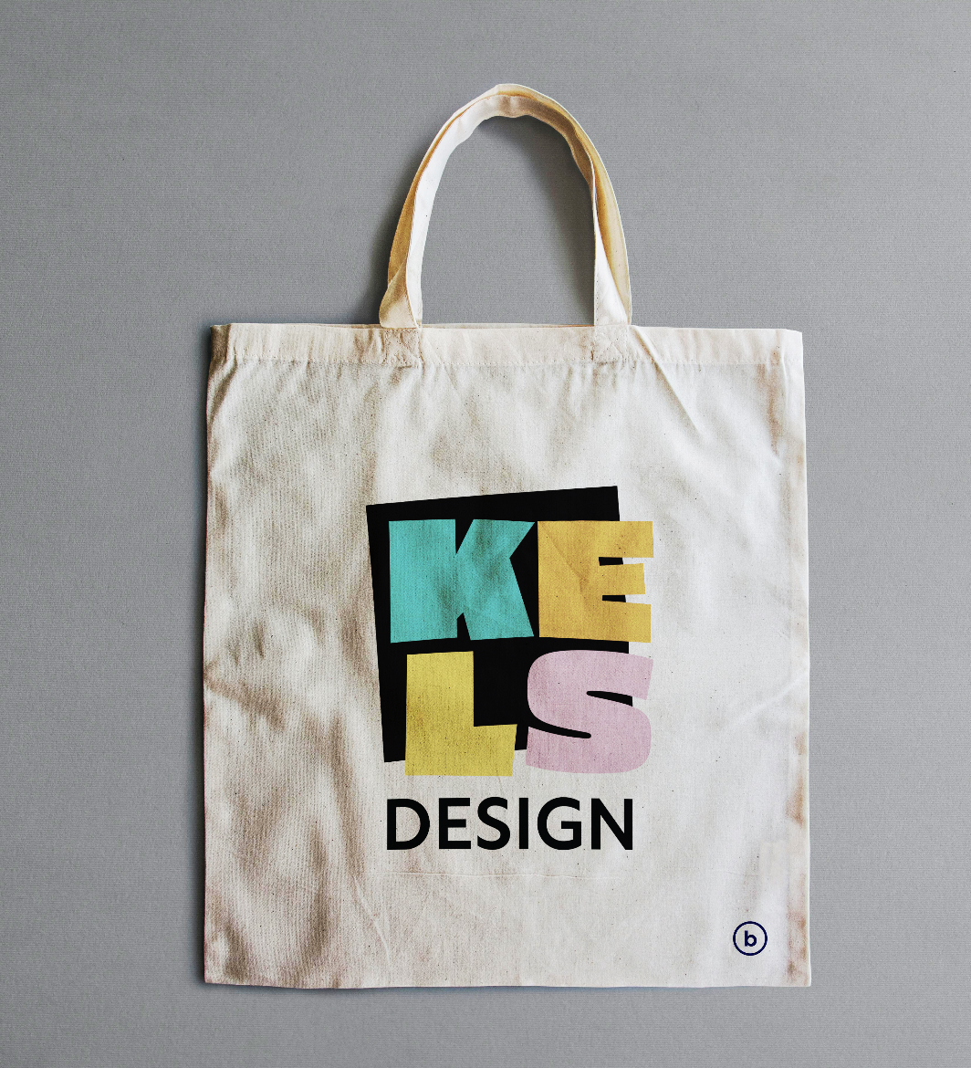
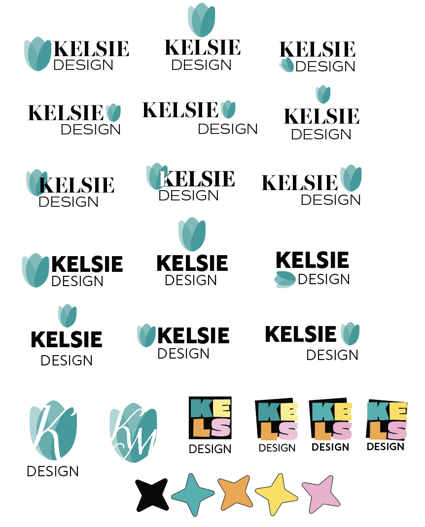
The goal of this project was to create a personal brand identity that people would remember and recognize. I wanted to make a logo that is bright, simple, and eye-catching, which is how I like to design. I made the final logo entirely in Adobe Illustrator as part of my Graphic Design work. I focused on making it clear, adaptable, and visually strong.
The hardest part of this project was figuring out how to express who I am as a person in a way that is authentic to me and turn that into a personal logo. It took a lot of thought and work to make a logo that not only represents my personality but also gets my message across clearly and effectively. The hardest but most rewarding part of the process was finding the right balance between self-expression and strong design principles.

The process for this project had many important steps. The first step was to do research to learn about the subject matter and get the right information. After that, mood boards and sources of inspiration were used to find a visual direction. Then, mind mapping was used to organize ideas and find connections. The sketches were then turned into the first design ideas, which were improved through a number of changes until the final infographic was finished.
My solution to this project was to showcase a watering can growing the plants below and having all the information follow the flow of the main design. Also adding compelling graphics to peek readers interest.